Welcome to the Treehouse Community
Want to collaborate on code errors? Have bugs you need feedback on? Looking for an extra set of eyes on your latest project? Get support with fellow developers, designers, and programmers of all backgrounds and skill levels here with the Treehouse Community! While you're at it, check out some resources Treehouse students have shared here.
Looking to learn something new?
Treehouse offers a seven day free trial for new students. Get access to thousands of hours of content and join thousands of Treehouse students and alumni in the community today.
Start your free trial
Jimmy Mannan
5,201 PointsHow to Space out links across the nav bar?
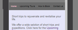
I have four links in the nav bar and they are spaced out across the nav bar when viewing through small screen size(for mobile) but with desktop viewing, they seem centered in the middle and not spaced out across the bar.
If I increase the padding or margin, the links space out across the width of the nav bar as I want for desktop size but take two lines when viewing in mobile.
Is there any way that the links:
- stay in one line 2.spread across the nav bar for all screen size.
screenshots:
for desktop
for mobile
7 Answers
Robert Richey
Courses Plus Student 16,352 PointsHi Jimmy Mannan,
My go-to technique for centering elements is flexbox. CSS Beyond the Basics starts off talking about this and may provide the help you're looking for.
The tl;dr version is that a parent element can be made into a flex box with display: flex and it's direct children will be flex items. Without seeing all your code this is just theory, and you'll need to experiment. The first thing I'd try is this:
nav ul{
  list-style: none;
  margin: 0 2px;
  padding: 0;
  display: flex;
  justify-content: space-around;
}
Here is a CSS-Tricks article on flexbox that I often reference.
This isn't the only way to go about centering content - it's just my favorite way. Please let me know if this helps or not.
Cheers!
Jimmy Mannan
5,201 PointsThanks a ton Robert!! Got what I wanted plus lots of additional tricks too...
Have a great day!
Joshua Todd
1,167 PointsMan you just fixed all my problems
Ayoub AIT IKEN
12,314 Pointshey ! try to float your nav bar to the right and your logo to the left, while clearing both sides.
Ayoub AIT IKEN
12,314 Points/* this includes your ul */
nav {
background : none;
float:right;
font-size: 1.125em;
margin-right: 5%;
text-align:right;
width:45%;
}
/* this is to float your logo ( if you have it ) to the right */
#logo {
float:left;
margin-left:5%;
text-align:left;
width:45%;
}
Jimmy Mannan
5,201 PointsThanks Ayoub for your reply... I have added screenshots now to explain myself better. I think my query wasnt very clear.
The nav bar has to stay for the entire width of the screen and I want the links to spread out too instead of clustering in the centre as they are for the desktop size.
Ayoub AIT IKEN
12,314 Pointsso, if I understand, you want the nav bar, on the desktop version, to be aligned on the right of the screen and not in the middle, right ?
Jimmy Mannan
5,201 PointsNo I want them evenly spread out across the width of the bar...In the mobile version they are covering the entire width but in the desktop version they are clustered in the center..i want them to space out so they are covering the entire nav bar like this (done in photoshop):
thanks for your time Ayoub
Ayoub AIT IKEN
12,314 Pointsgive your html header please !
Jimmy Mannan
5,201 PointsThanks Ayoub..
Robert's answer above solved the issue.
Have a good day!
samanthametcalfe2
5,820 Pointsnav ul {
padding:0;
display: flex;
justify-content: space-around;
border:1px solid white;
}
nav ul li {
border-left:1px solid white;
list-style-type:none;
padding:10px;
width:100%; /*this is the line that helped me get rid of the white space at the start of my nav */
}
nav ul li a {
text-decoration:none;
}


Jimmy Mannan
5,201 PointsJimmy Mannan
5,201 Points