Welcome to the Treehouse Community
Want to collaborate on code errors? Have bugs you need feedback on? Looking for an extra set of eyes on your latest project? Get support with fellow developers, designers, and programmers of all backgrounds and skill levels here with the Treehouse Community! While you're at it, check out some resources Treehouse students have shared here.
Looking to learn something new?
Treehouse offers a seven day free trial for new students. Get access to thousands of hours of content and join thousands of Treehouse students and alumni in the community today.
Start your free trial
Justin Sze Wei Teo
9,418 PointsLogo & Navigation don't line up
Hi,
After typing in the code for min-width:660px pertaining to nav and #logo, the logo appears to be on top left and the navigation links appear to be on the bottom right of the header portion. In short, they are not lined up on the same line.
Kindly refer to following link to have a look of what I mean, http://port-80-3boxwgyy2j.treehouse-app.com/about.html
Below is the link to the code I have written, https://teamtreehouse.com/workspaces/13714422#
Anyone care to advise me what went wrong?? Thanks!
7 Answers
Shawn Denham
Python Development Techdegree Student 17,802 PointsI am with Jason DeValadares here.
There are a lot of issues you could be having from collapsing floats to your display properties to your column widths...just impossible to know for sure and we are just shooting in the dark without seeing both your HTML and CSS :D
If you can get both your HTML and CSS to us I am 1000% sure one or both of us can solve your problem!
Shawn Denham
Python Development Techdegree Student 17,802 PointsHi Justin,
Neither of your links work. Can you just post your HTML and CSS here? You can check the link for the "Markdown Cheatsheet" at the bottom of this page right above the post answer button to see how to post code in the forums.
Cheers!
Jason DeValadares
7,190 PointsWithout seeing your code it's hard to know what's going on. It could be some padding or margins in the way, or even the resolution you're using... my best way of troubleshooting these things is to inspect the elements and have it highlight the padding and margins of the object in question, as well as all the objects around it. Most times you'll find something that's either being inherited or an object is forcing it to a different location.
Justin Sze Wei Teo
9,418 PointsHi Shawn & Jason,
Wow before I proceed I have to say both of you guys are fantastic! Didn't expect to get a response so quick.
Please find below an image of what I'm currently experiencing (Logo words & Navigation link not in line when the screen is more than 660px in width),
Below is my Responsive CSS code,
@media screen and (min-width: 480px) {

  /*********************
  TWO COLUMN LAYOUT
  **********************/

  #primary {
    width: 50%;
    float: left;
}
  #secondary {
    width: 40%;
    float: right;
}


  /*********************
  PAGE: PORTFOLIO
  **********************/

      /*********************
  - We're working towards 3 images side by side.
  - Total width taken up by 3 images = 3 images * X , where X is unknown width per image
  - Margin of 2.5% on either side of images, hence margin space total is 2.5% * 2 on either side of each image * 3 images = 15%
  - Each element image's width = 85% / 3 = 28.33333%
  **********************/

  #gallery  li {
    width: 28.3333%;
 }

  #gallery li:nth-child(3n+1) {
    clear:left;
 }

  /*********************
  PAGE: ABOUT
  **********************/

  .profile-photo {
    float:left;
    margin: 0 5% 80px 0;
  }

}


@media screen and (min-width: 660px) {
    /*********************
  HEADER
  **********************/

  nav {
    background: none;
    float: right;
    font-size: 1.125em;
    margin-right: 5%;
    text-align: right;
    width:45%;
  }

  #logo {
    float: left;
    margin-left: 5%;
    text-align: left;
    width: 45%;
  }

  h1 {
    font-size: 2.5em;
  }

  h2 {
    font-size: 0.825em;
    margin-bottom: 20px;
  }

  header {
    border-bottom: 5px solid #599a68;
    margin-bottom: 60px;
  }

}
}
And below is my Main.CSS code,
/*********************
GENERAL
**********************/

body {
  font-family: 'Open Sans', sans-serif;
}

#wrapper {
  max-width: 940px;
  margin: 0 auto;
  padding: 0 5%;
}

a {
  text-decoration:none;
}

img {
  max-width: 100%;
}

h3 {
  margin: 0 0 1em 0;
}
/*********************
HEADING
**********************/

header {
  float:left;
  margin: 0 0 30px 0;
  padding: 5px 0 0 0;
  width: 100%
}

#logo {
  text-align: center;
  margin: 0;
}

h1 {
  font-family:'Changa One', sans-serif;
  margin: 15px 0;
  font-size: 1.75em;
  font-weight:normal;
  line-height:0.8em;
}

h2 {
    margin: -5px 0 0;
    font-size: 0.75em;
    font-weight:normal:

}


/*********************
NAVIGATION
**********************/

nav {
  text-align: center;
  padding: 10px 0;
  margin: 20px;
}

nav ul {
  list-style: none;
  margin:0 10px;
  padding: 0;
}

nav li {
  display: inline-block;
}

nav a {
  font-weight: 800;
  padding: 15px 10px;
}


/*********************
FOOTER
**********************/

footer {
  font-size: 0.75em;
  text-align: center;
  clear: both;
  padding-top: 50px;
  color:  #ccc;

}

.social-icon {
  width: 20px;
  height: 20px;
  margin: 0 5px;
}

/*********************
PAGE: PORTFOLIO
**********************/

#gallery {
  margin: 0;
  padding: 0;
  list-style: none;
}

#gallery li {
  float: left;
  width: 45%;
  margin: 2.5%;
  background-color: #f5f5f5;
  color: #bdc3c7;
}

#gallery li a p {
  margin: 0;
  padding: 5%;
  font-size:0.75em;
  color: #bdc3c7;
}


/*********************
PAGE: ABOUT
**********************/

.profile-photo {
  clear:both;
  display:block;
  max-width: 150px;
  margin: 0 auto 30px;
  border-radius: 20%;
}

/*********************
PAGE: CONTACT
**********************/

.contact-info {
  list-style: none;
  padding: 0;
  margin: 0;
  font-size: 0.9em;
}

.contact-info a {
 display:block;
 min-height: 20px;
 background-repeat:no-repeat;
 background-size: 20px 20px;
 padding: 0 0 0 30px;
 margin: 0 0 10px;
}

.contact-info li.phone a {
 background-image: url('../Images/phone.png')
}

.contact-info li.mail a {
 background-image: url('../Images/mail.png')
}

.contact-info li.twitter a {
 background-image: url('../Images/twitter.png')
}


/*********************
COLORS
**********************/

/*Site Body*/
body {
background: #fff;
color:#999;
}

/* Green Header*/
header {
  background:#6ab47b;
  border-color:#599a68;
}

/* nav background on mobile*/
nav {
  background: #599a68;
}

/* Logo Text*/
h1, h2 {
  color: #fff;
}

/* Links*/
a {
  color:#6ab47b;
}


/* nav link*/
nav a, nav a:visited {
  color:#fff;
}

/* Selected nav link*/
nav a.selected, nav a:hover {
 color:#32673f;
}
Sorry for the long post, but I can't seem to figure out why the navigation and logo cant be on same line!
Jason DeValadares
7,190 Pointswithout the HTML I'm guessing but it looks like the menu is blocking out the full width of the header. This could be the div it's sitting in or the list itself. When you inspect it with dev tools does it show blocking out the full width? If so is it maybe the li you have here:
nav li {
  display: inline-block;
}
Again, just a guess without being able to see the HTML but try changing that to just inline or maybe looking through the dev tool highlighter to see what's picking up the block without a width provided.
Steven Burrows
2,607 PointsI had the same issue but went onto the next video, I checked my css files and got 2 errors where I missed something, once fixed it fixed the alignment issue
Justin Sze Wei Teo
9,418 PointsHi Jason & Shawn,
Thanks for getting back. I tried changing it to 'inline' instead of "inline-block", but there seems to be no change. Here's the image of the issue I'm experiencing to refresh everyone's memories as I haven't responded in a while!
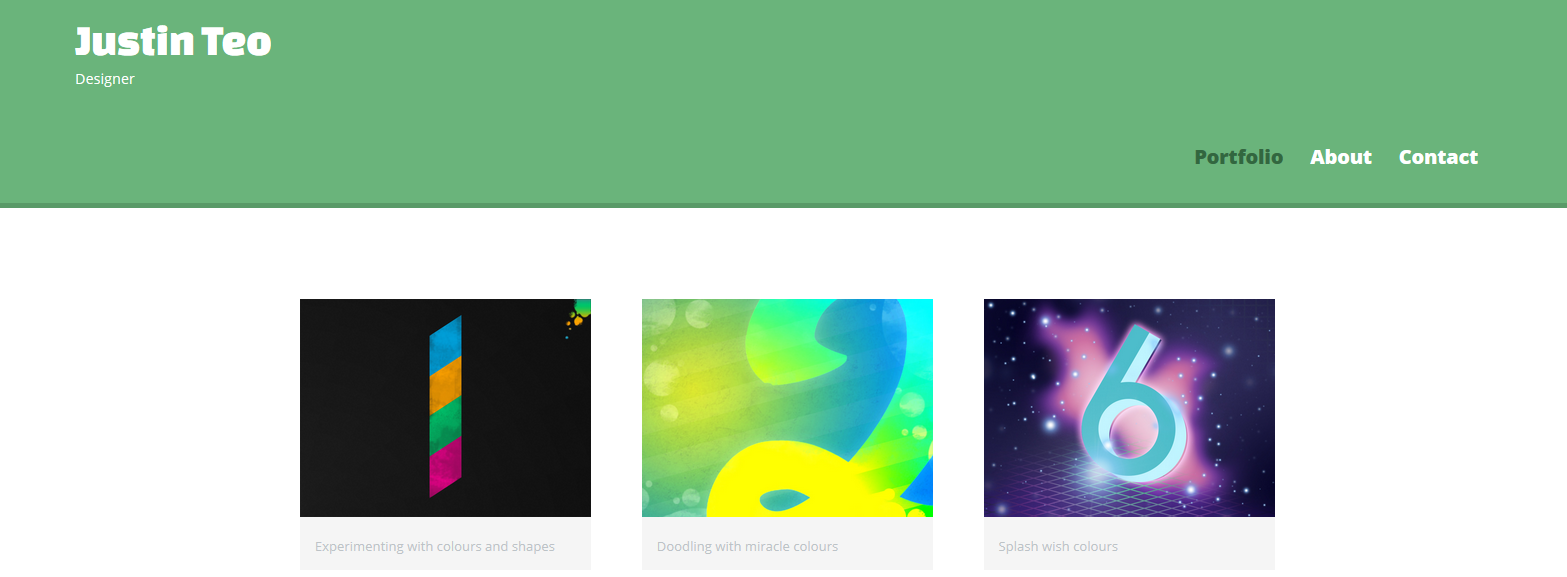
Kindly find below a copy of the index.html file to give you a better idea of tracing the error.
<!DOCTYPE html>
<html>
<head>
<meta charset="utf-8">
<title>Justin Teo | Designer</title>
<link rel="stylesheet" href="CSS/normalize.css">
<link href='https://fonts.googleapis.com/css?family=Changa+One|Open+Sans:400,400italic,700italic,700,800' rel='stylesheet' type='text/css'>
<link rel="stylesheet" href="CSS/main.css">
<link rel="stylesheet" href="CSS/responsive.css">
<meta name="viewport" content="width=device-width, initial-scale=1.0">
</head>
<body>
<header>
<a href="index.html" id="logo">
<h1>Justin Teo</h1>
<h2>Designer</h2>
</a>
<nav>
<ul>
<li><a href="index.html" class="selected">Portfolio</a></li>
<li><a href="about.html">About</a></li>
<li><a href="contact.html">Contact</a></li>
</ul>
</nav>
</header>
<div id="wrapper">
<section>
<ul id="gallery">
<li>
<a href="Images/numbers-01.jpg">
<img src="Images/numbers-01.jpg" alt="">
<p>Experimenting with colours and shapes</p>
</a>
</li>
<li>
<a href="Images/numbers-02.jpg">
<img src="Images/numbers-02.jpg" alt="">
<p>Doodling with miracle colours</p>
</a>
</li>
<li>
<a href="Images/numbers-06.jpg">
<img src="Images/numbers-06.jpg" alt="">
<p>Splash wish colours</p>
</a>
</li>
<li>
<a href="Images/numbers-09.jpg">
<img src="Images/numbers-09.jpg" alt="">
<p>Psychedelic designs</p>
</a>
</li>
<li>
<a href="Images/numbers-12.jpg">
<img src="Images/numbers-12.jpg" alt="">
<p>Incredibly colourful</p>
</a>
</li>
</ul>
</section>
<footer>
<a href="https://www.facebook.com/justin.tsw"> <img src="Images/facebook-wrap.png" alt="Here lies the facebook logo" class= "social-icon"></a>
<a href="http://twitter.com/nickrp"><img src="Images/twitter-wrap.png" alt="Here lies the facebook logo" class= "social-icon"> </a>
<p>© 2014 Justin Teo. </p>
</footer>
</div>
</body>
</html>
This is my about.html code,
<!DOCTYPE html>
<html>
<head>
<meta charset="utf-8">
<title>Justin Teo | Designer</title>
<link rel="stylesheet" href="CSS/normalize.css">
<link href='https://fonts.googleapis.com/css?family=Changa+One|Open+Sans:400,400italic,700italic,700,800' rel='stylesheet' type='text/css'>
<link rel="stylesheet" href="CSS/main.css">
<link rel="stylesheet" href="CSS/responsive.css">
<meta name="viewport" content="width=device-width, initial-scale=1.0">
</head>
<body>
<header>
<a href="index.html" id="logo">
<h1>Justin Teo</h1>
<h2>Designer</h2>
</a>
<nav>
<ul>
<li><a href="index.html">Portfolio</a></li>
<li><a href="about.html" class="selected">About</a></li>
<li><a href="contact.html">Contact</a></li>
</ul>
</nav>
</header>
<div id="wrapper">
<section>
<img src="Images/justin.jpg" alt= "Photograph of Justin Teo" class="profile-photo">
<h3>About</h3>
<p> Hi, I'm Justin Teo! This is my portfolio showcasing my extensive experience in front end web development</p>
<p>If you'd like to follow me on twitter my username is <a href = "http://twitter.com/nickrp">@nickrp </a> </p>
</section>
<footer>
<a href="https://www.facebook.com/justin.tsw"> <img src="Images/facebook-wrap.png" alt="Here lies the facebook logo" class= "social-icon"></a>
<a href="http://twitter.com/nickrp"><img src="Images/twitter-wrap.png" alt="Here lies the facebook logo" class= "social-icon"> </a>
<p>© 2014 Justin Teo. </p>
</footer>
</div>
</body>
</html>
And.. my contact.html code...
<!DOCTYPE html>
<html>
<head>
<meta charset="utf-8">
<title>Justin Teo | Designer</title>
<link rel="stylesheet" href="CSS/normalize.css">
<link href='https://fonts.googleapis.com/css?family=Changa+One|Open+Sans:400,400italic,700italic,700,800' rel='stylesheet' type='text/css'>
<link rel="stylesheet" href="CSS/main.css">
<link rel="stylesheet" href="CSS/responsive.css">
<meta name="viewport" content="width=device-width, initial-scale=1.0">
</head>
<body>
<header>
<a href="index.html" id="logo">
<h1>Justin Teo</h1>
<h2>Designer</h2>
</a>
<nav>
<ul>
<li><a href="index.html">Portfolio</a></li>
<li><a href="about.html" >About</a></li>
<li><a href="contact.html" class="selected">Contact</a></li>
</ul>
</nav>
</header>
<div id="wrapper">
<section id="primary">
<h3>General Information</h3>
<p>I am currently a full-time freelance web developer. If you have any queries, feel free to reach out to me.</p>
<p>Feel free to reach me by both phone and email.</p>
</section>
<section id="secondary">
<h3>Contact Details</h3>
<ul Class="contact-info">
<li class="phone"><a href="tel:8102-5723">8102-5723</a></li>
<li class="mail"><a href="mailto:justin.tsw@gmail.com">justin.tsw@gmail.com</a></li>
<li class="twitter"><a href="http://twitter.com/intent/tweet?screen_name=nickrp">@nickrp</a></li>
</ul>
</section>
<footer>
<a href="https://www.facebook.com/justin.tsw"> <img src="Images/facebook-wrap.png" alt="Here lies the facebook logo" class= "social-icon"></a>
<a href="http://twitter.com/nickrp"><img src="Images/twitter-wrap.png" alt="Here lies the facebook logo" class= "social-icon"> </a>
<p>© 2014 Justin Teo. </p>
</footer>
</div>
</body>
</html>
Thanks so much for helping out guys!!
Carlos Cortes
638 PointsHaving issues with the CSS file, I don't have the gallery getting display in 2 columns Here is my main CSS code:
/**************
GENERAL
****************/

a {
  text-decoration: none;
}

img {
  max-width: 100%;
}

body {
 font-family: 'Bitter', serif;
}

#wrapper {
  max-width: 940px;
  margin: 0 auto;
  padding: 0 5%;
}

a {
  color: #6ab47b;
}

/**************
HEADING
****************/

header {
  background: #6ab47b;
  border-color: #599a68;
}

#logo {
  text-align: center;
  margin: 0;
}

h1 {
  font-family: 'Roboto', sans-serif;
  margin: 15px, 0;
  font-size: 1.75em;
  font-weight: normal;
  line-height: 0.8em;
}

h2 {
  font-size: 0.75em;
  margin: -5px 0 0;
  font-weight: normal;
}

/**************
NAVIGATION
****************/

nav {
  text-align: center;
  padding: 10px 0;
  margin: 20px 0 0;
}

nav {
  background: #599a68;
}

nav a, nav a:visited {
  color: #fff;
}

nav a.selected, nav a:hover {
  color: #32673f;
}


/**************
FOOTER
****************/

footer {
  font-size: 0.75em;
  text-align: center;
  padding-top: 50px;
  color: #ccc;
}


/**************
PAGE: PORTFOLIO
****************/

#gallery {
  margin: 0;
  padding: 0;
  list-style: none;
}

gallery li {
  float: left;
  width: 45%;
  margin: 2.5%;
  background-color: #f5f5f5;
  color: #bdc3c7;
}


/**************
COLORS
****************/


h1, h2 {
  color: #fff;
}

body {
  background-color: #fff;
  color: #999;
}
Justin Sze Wei Teo
9,418 PointsJustin Sze Wei Teo
9,418 PointsHi Shawn/Jason,
Sorry ta disturb you guys again.. I've pasted the HTML code below.. any idea why my navigation isn't in line?