Welcome to the Treehouse Community
Want to collaborate on code errors? Have bugs you need feedback on? Looking for an extra set of eyes on your latest project? Get support with fellow developers, designers, and programmers of all backgrounds and skill levels here with the Treehouse Community! While you're at it, check out some resources Treehouse students have shared here.
Looking to learn something new?
Treehouse offers a seven day free trial for new students. Get access to thousands of hours of content and join thousands of Treehouse students and alumni in the community today.
Start your free trial
Michael Taberner
7,773 PointsText overflow with body padding
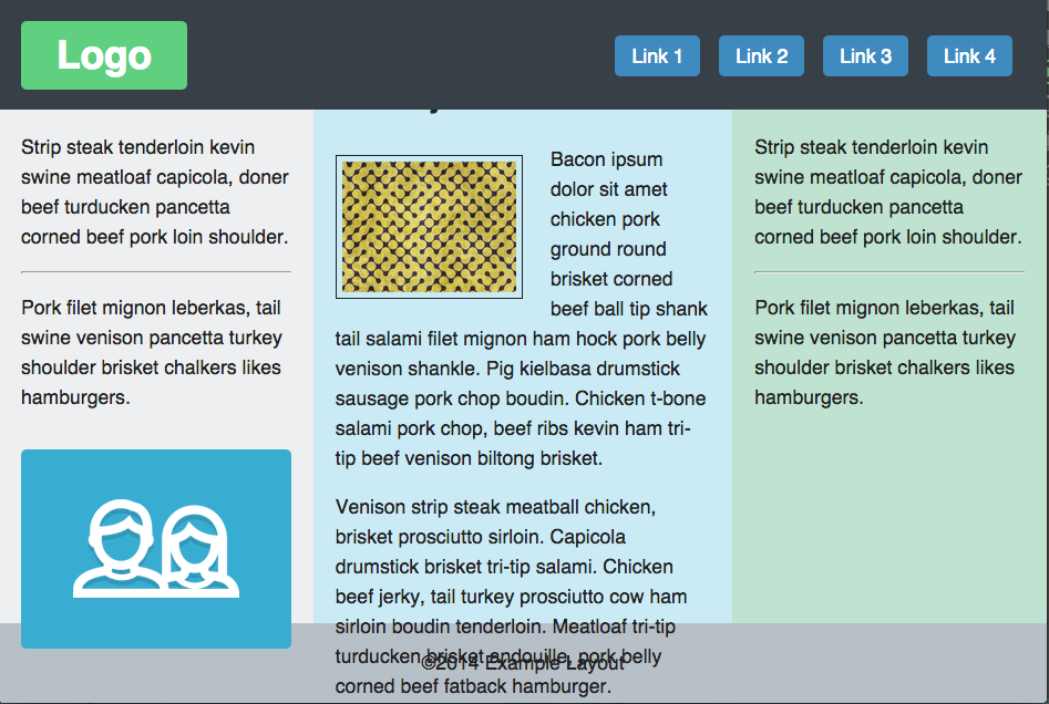
After adding the following code added at the end of the video to show the body hidden under the header, the text and the icon box overflow into my footer.
body {
    padding-top: 100px;
}
After messing around with it for a while, it seems to me that all of the content in the column divs are being pushed down 100px without expanding the divs. How do you stop this overflow from happening?
Here is the full css:
/* Page Styles
================================ */

* {
    -moz-box-sizing: border-box;
    box-sizing: border-box;
}


html,
body {
    height: 100%;
}


body {
    font: normal 1.1em/1.5 sans-serif;
    color: #222;
    background-color: #edeff0;
}

/* Layout Element Colors
================================ */

.main-header       { background-color: #384047; }
.main-logo a       { background-color: #5fcf80; }
.main-nav a        { background-color: #3f8abf; }
.primary-content   { background-color: #caebf6; }
.secondary-content { background-color: #bfe3d0; }
.main-footer       { background-color: #b7c0c7; }

/* Main Layout Styles
================================ */

.main-header {
  padding: 15px;
  min-height: 100px;
}
.main-logo {
  margin-top: 0;
  margin-bottom: 0;
}
.main-nav li {
  margin-top: 15px;
}
.main-logo a,
.main-nav a {
  display: block;
  color: white;
  text-decoration: none;
  text-align: center;
  padding: 5px 15px;
  border-radius: 5px;
}
.main-footer {
  text-align: center;
  padding-top: 5px;
  padding-bottom: 5px;
}


/* Column Layout on mobile
================================ */

.col {
  padding: 20px;
}
.extra-content,
.main-banner {
  display: none;
}

/* Imagery (responsive images)
================================ */

.feat-img {
  width: 100%;
  margin-top: 10px;
  margin-bottom: 10px;
  border: solid 1px;
  padding: 5px;
}

.icon {
  background-color: #39add1;
  margin-top: 34px;
  height: 180px;
  border-radius: 5px;
  position: relative;
}

.icon:after {
  content: "";
  display: block;
  width:  150px;
  height: 90px;
  background: url('../img/icon.png') no-repeat;
  background-size: 100%;
  position: absolute;
  top: 0;
  right: 0;
  bottom: 0;
  left: 0;
  margin: auto;
}

/* Float Clearfix
================================ */

.group:after {
  content: " ";
  display: table;
  clear: both;
}

/* Media Queries
================================ */

@media (min-width: 769px) {

  .main-wrapper,
    .content-row {
    height: 100%;
    }

    body {
        padding-top: 100px;
    }

    /* Header, Banner and Footer Layout
    ================================ */

    .main-header {
        position: fixed;
        width: 100%;
        top: 0;
        z-index: 100;
    }
    .main-logo,
    .main-nav {
        position: absolute;
    }
    .main-logo {
        width: 150px;
        top: 20px;
        left: 20px;
    }
    .main-nav {
        bottom: 30px;
        right: 25px;
    }
    .main-nav li {
        margin-right: 6px;
        margin-left: 6px;
        display: inline-block;
    }
    .main-banner {
        background: #dfe2e4;
        text-align: center;
        padding: 50px 15px;
    }

    /* Column Layout
    ================================ */

    .extra-content,
    .main-banner {
        display: block; /* Unhide from mobile view */
    }

    .content-row {
        position: relative;
    }
    .col {
        width: 30%;
        position: absolute;
    }
    .primary-content {
        width: 40%;
        left: 30%;
    }
    .secondary-content {
        right: 0;
    }

    /* Imagery
    ================================ */

    .feat-img {
        width: 50%;
        float: left;
        margin-right: 25px;
    }

}
2 Answers
Samuel Webb
25,370 PointsIs your footer fixed bottom? As in, the background is supposed to scroll under it? If so, you should be able to give it a z-index higher than everything else and it'll show on top.
footer {
  z-index: 1000;
}
That may work for you.
Chris Dyer
18,518 PointsHey Michael, I ran into this myself. I removed the padding-top from the body and changed the padding of the main-banner to fix this.
.main-banner {
    background: #dfe2e4;
    text-align: center;
    padding: 150px 15px 50px 15px;
}

Samuel Webb
25,370 PointsSamuel Webb
25,370 PointsActually I don't think this is the answer that you were looking for. I would have to see the rest of your CSS to know exactly what the problem is.
Michael Taberner
7,773 PointsMichael Taberner
7,773 PointsYeah, I wasn't looking for a fixed footer. I've updated the question with the rest of the css.