Well done!
You have completed CSS-Only Facebook Reactions UI - Treehouse Live!
- 2x 2x
- 1.75x 1.75x
- 1.5x 1.5x
- 1.25x 1.25x
- 1.1x 1.1x
- 1x 1x
- 0.75x 0.75x
- 0.5x 0.5x
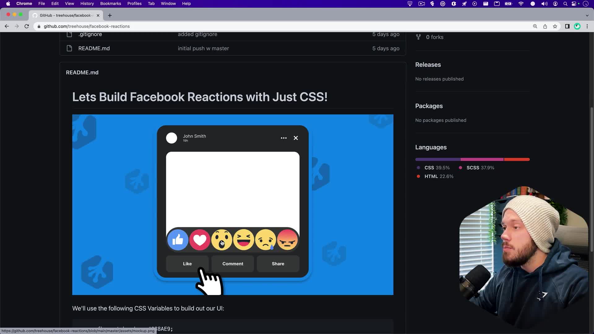
Most social media platforms allow users to interact with other users’ posts. Letting users use an emoji to show how they feel about them is a fun way to add some interactivity to your project or app. Follow along as Dustin reveals how to recreate the Facebook reactions UI with just CSS!
Related Discussions
Have questions about this video? Start a discussion with the community and Treehouse staff.
Sign upRelated Discussions
Have questions about this video? Start a discussion with the community and Treehouse staff.
Sign up[MUSIC] 0:00 Hey, whats up, everyone? 0:09 Are you ready to build out the Facebook Reactions UI? 0:10 I know I'm ready, so if you want to follow along just go to 0:14 github.com/treehouse/facebook-reactions. 0:20 When you get to the repo for the project, 0:26 the first thing you'll see in the README is this big mockup. 0:28 This is what we'll be building out. 0:31 It's basically just one instance of a Facebook post or 0:33 social media post with just a little bit of info in there, nothing crazy. 0:37 But the real magic is this Like button. 0:42 We'll write some code so that when we hover over this Like button, 0:44 this menu with all these reactions will pop up, and we can hover over each one. 0:49 And it'll have a little bit of a animation. 0:55 And this will be done with just HTML and CSS, so no JavaScript needed. 0:58 Underneath the mockup you will see some CSS variables, and 1:04 these are just what we're gonna be using to style up this UI. 1:07 So if you wanna follow along, let's just grab this big green Code button, 1:11 click copy, and you can use GitHub desktop or your terminal. 1:16 I'm gonna use my terminal, and I'm gonna clone down this project. 1:19 So I'm gonna cd to my desktop, and I'm gonna git clone and paste in that link. 1:24 And now I have the project on my desktop. 1:30 I'm gonna drag it to VS Code, and let's take a look at the files and 1:32 directories that we have in here. 1:36 So the first thing you'll see is master. 1:41 So if at any point your code just doesn't work or doesn't look like mine, 1:43 you can hop into master and see all the finished code. 1:47 So if we view the index.html file inside the master directory in our browser, 1:50 this is a finished product of what we'll be building. 1:55 So it just looks like a standard social media post, and 1:59 if you hover over this Like button, you'll have these emojis that kinda mimic 2:02 the way Facebook does their reactions for their posts. 2:07 But the only thing is clicking on them won't do anything, cuz we're not gonna 2:12 write any JavaScript, we're just gonna get this functionality working with just CSS. 2:17 So let's close out of this. 2:23 And everything that we'll be doing is going to be inside of this starter 2:25 directory. 2:28 So let's take a look at what we have in here. 2:30 Inside the index.html, it is basically empty, 2:33 just our boilerplate code that links to our app.css file. 2:37 And we have an empty title which we'll just call Facebook Reactions UI. 2:42 Also, in the styles, there is an app.scss file as well as an app.css file. 2:51 I will be writing everything in SCSS, and I won't be doing anything complex with it, 3:00 I'll just be using it for nesting. 3:04 But if you'd like to follow along, 3:07 there's really no learning curve to how I'll be using it. 3:09 Just go to your Extensions panel, type in sass compiler, 3:12 and you'll wanna click on this third one 3:18 called Live Sass Compiler by Glenn Marks. 3:22 This is what I use. 3:28 All you need to do is install it, and whenever you're inside of a directory 3:30 with an app.scss file, all you need to do is hit this Watch Sass button at 3:35 the bottom and it'll compile everything we write into an app.css file, 3:40 which is what our index.html file is using. 3:45 If you do not wanna use SCSS, you can still follow along, 3:49 you just won't be able to nest the way that I do, and 3:53 you can just write your code directly into your app.css file. 3:56 But if you want to follow along with me, there's no learning curve, 4:01 like I mentioned, to writing SCSS, the way that I'm gonna be using it here. 4:04 And I'll try to explain how I use it as we go. 4:09 So first things first, let's start building out our UI. 4:13 And the easiest way to do this would be to pull up the mock-up on the right. 4:18 Or actually, let's bring the HTML on the right and the mock-up on the left. 4:23 Sweet, so let's start building this out. 4:30 First thing I'll do is inside of our HTML, 4:34 I'm just going to create one element for our entire UI. 4:37 And I'll just call that facebook-post. 4:41 Now, let's break down this entire post. 4:45 It looks like we have somewhat of a post header up here with 4:48 a little bit of content. 4:51 We have our post itself, and then we have this group of buttons. 4:54 So let's create three separate child elements inside of our facebook-post 4:58 container. 5:03 For now let's put some comments. 5:05 I'll put post header cuz we'll need a post header, we'll need the post itself, 5:06 and also we need our post interactions, which is our buttons. 5:12 So let's start off with the header. 5:18 We have a user image, we have a little bit of content right here, and 5:21 then we have a couple of more buttons on the right. 5:25 So I think for the image for just this project's sake, 5:29 I'll just leave that as a empty div. 5:33 You can come back and add in your own image if you want, 5:36 but I'll just create an empty div for this and I'll call it user-image. 5:40 Actually, we need to create the post header first, so 5:44 post-header, and I'll now create the user image. 5:49 And then, like I said, we'll leave this empty, and 5:53 then the next item in this header will be this info group. 5:57 We'll call it info-group. 6:01 And inside of this I'll have a span for the name. 6:04 So I'll write <span>John Smith. 6:08 Feel free to use your own name or another name. 6:10 I'm gonna create another span for the publishing time, which was 19 hours ago. 6:13 And then outside of our info group, I'm just gonna lay out our images. 6:19 So you'll notice I forgot to go over the Assets folder, but 6:25 the Assets folder has all of our images in it. 6:30 It has our mock-up, our background that we're gonna be using, 6:33 our two SVGs for our close and ellipsis icons, 6:38 which we will use as just regular images instead of inline SVGs. 6:42 And in our reactions directory, we have our angry, 6:48 heart, laugh, like, sad, and our wow reactions. 6:53 So, let's go back into the HTML, and we want to use this ellipsis icon. 6:59 So we will go to assets, and we'll click ellipsis.svg. 7:06 And we can delete the alt attribute, we're not going to need that for 7:13 this project specifically. 7:17 And then I will toggle our close.svg. 7:20 I can't type, svg, and I'll delete the alt attribute. 7:26 So let's save, and we're not viewing the page live yet, so no worries. 7:31 Once we finish writing out the markup, we'll take a look at what that looks like. 7:37 So I think that's it for the header. 7:42 So I'll close off the header, and now we have the post itself, 7:45 which I'm just going to leave as an empty div called post. 7:49 You can come back and add in an image or some text if you'd like, 7:53 whatever you wanna do. 7:56 But for the sake of this demonstration, we'll just leave this empty. 7:58 And for our post interactions, we'll create a div called post-interactions, 8:03 and inside we'll have three buttons. 8:08 So I'll do button*3, and if you're unfamiliar with what I just did, 8:10 that's an Emmet shortcut. 8:16 So just type in button*3 and it'll create three buttons. 8:19 We got Like, we have Comment, and we have Share. 8:23 Now, one thing to note, that this menu right here with the reactions 8:30 will actually live inside of our Like button. 8:35 So let's go into the markup and adjust this just a little bit. 8:39 So what I'll do is I'll create a div called reactions, 8:45 and in here will be a span, we'll do six of them, so we'll do span*6. 8:48 And in each one of these, we will pop in our reaction images. 8:54 So, let's put each one of these spans on their own line. 8:59 Sweet, and let's write img, and 9:03 we'll do assets, and we'll do reactions. 9:08 And the first one is like.png. 9:13 And what I'll do is we'll also remove the alt attribute, we won't need these. 9:17 I'm gonna copy this and I'm gonna paste this into all the spans, and 9:23 then we'll just update the path name. 9:27 So, looks like the first one is the like button, 9:30 then we have the heart, so we'll change the second one to heart. 9:34 The third one looks like it's wow, so we'll change it to wow. 9:39 The fourth one is laugh. 9:46 I'm not sure why my mock-up keeps moving like that, 9:49 it's kind of annoying, but sorry. 9:53 So the second to last one is sad. 9:56 And the last one is angry. 10:00 All right, so we'll hit Save. 10:04 And believe it or not, 10:06 I think that is actually everything we'll need for the markup. 10:08 Yep, so we have our facebook-post. 10:16 And inside of our post we have our header, we have the post itself, and 10:18 then we have our three buttons. 10:22 And inside of the first button holds our container with all of our reactions. 10:25 So I'll close out of the mockup for now. 10:31 Let's view this in the browser. 10:33 So I'll open this up with Live Server. 10:38 And yeah, so it looks like we have our three buttons, we have all six reactions, 10:40 we have our really, really big SVGs, and we have our content for the header. 10:46 Sweet, so, let's open this up on the side, and 10:54 we'll get the Visual Studio Code opened up on the other side. 10:56 And now, we need to start styling this up a little bit. 11:00 So, Let me open up the mockup, 11:05 just so that we can try to style it up accordingly. 11:11 And I'll also open up our style sheet. 11:16 I'll put the style sheet over here. 11:21 I'll close this. 11:23 Let me make this a little bit smaller so I can get to this Watch Sass button. 11:25 So if you are following along with me and you wanna use the SCSS, 11:28 make sure you download the Live Sass compiler extension, and 11:32 then click on this Watch Sass button when you have your app.scss file open. 11:36 So I'm gonna click it, and you should have this panel that comes up. 11:41 Unfortunately, you can't close it. 11:46 I like to put it at the bottom. 11:48 If you do try to close it, 11:50 it's just gonna pop up as soon as you make a change to your SCSS file. 11:52 But I just normally put it all the way at the bottom when I'm working 11:55 with limited space like we are right now. 11:59 So I will zoom in just a tad, On the mockup. 12:01 Well, it won't let me, so let me reopen it. 12:08 There we go. Open this up on the right. 12:12 Awesome. 12:18 All right, so let's get started with building out the UI. 12:19 You can either go back to the repository or go to the readme and 12:24 copy down these CSS variables. 12:28 But these are the variables I mentioned earlier that we'll be using to 12:31 build out the UI. 12:33 So the first thing I wanna do in my SCSS file is create a route. 12:34 And paste those in. 12:42 I'm gonna move the mockup to the bottom so we can see everything a little bit bigger. 12:44 There we go. 12:54 All right. 12:58 This should work for now. 13:00 So let's make the code a little bit bigger. 13:04 Awesome. 13:07 So we have our root and we pasteed in all of our CSS variables. 13:08 And if you're unsure how to use CSS variables, we'll use the first one now. 13:11 We'll target the body. 13:16 And we'll give it a background-image. 13:18 Actually, we will use the variables in a bit. 13:23 Let's set up the background-image first. 13:26 So, we'll do background-image URL and 13:29 we'll navigate to our assets folder and then to thbg.png. 13:33 Hit save and we'll see our new background in the browser. 13:38 We wanna give a min-height to the browser window, we'll do 100 view height. 13:43 Also we wanna center this in the page, 13:50 so we'll use Flexbox for that. 13:55 We can do a display of flex will align items center and 13:59 we'll justify the content center also. 14:03 I'll hit Save and you won't notice anything yet 14:09 because we have a lot of content. 14:11 So I think that might be it for the body. 14:12 So, let's start tackling, Let's start tackling the Facebook post itself. 14:15 So I'll create a facebook-post rule. 14:24 I need to spell it right. 14:28 There we go. 14:31 And now we'll use a CSS variable. 14:32 All right, background-color. 14:35 And to use a CSS variable, you just write the var keyword with a set of parentheses. 14:38 And then you grab the variable that you want. 14:43 And all your variables start with two dashes. 14:45 So we'll grab the --fb-post-bg variable, and 14:48 we'll paste it inside of those parentheses. 14:51 Let's save, and now you should see that darker color for our actual post. 14:54 I'm gonna close this up. 15:02 So let's give our post a width of 80% so that we have a little 15:06 bit of spacing, which works fine but if we had a wider browser it 15:11 would also just get way bigger, so let's also set a max width. 15:16 And we can do a max-width of 500 pixels. 15:23 And it should keep it small. 15:27 Awesome, there we go. 15:29 So the next thing, let's start with the border radius and this border. 15:32 So we'll do a border-radius of 2rem. 15:38 I think that looks okay. 15:42 We'll add some padding also, we can do maybe 1rem top and 15:44 bottom, 2rem left and right. 15:49 And we'll add a border of .85 rem solid. 15:53 And for the color, we'll set this up in a variable as well. 15:57 We have --fb-post-border. 16:02 So I'll copy that, I'll paste it in there. 16:05 Sweet. And it's a little hard to see, 16:09 but we can also add some box-shadow that can help. 16:12 We can do 0 12px 12px. 16:15 We'll do rgba. 16:18 We'll do black with a 0.15 opacity. 16:20 And it's a little bit more visible. 16:25 It's not meant to be super in-your-face. 16:26 So this looks pretty good. 16:29 All right, so I think for now that might be everything we need for 16:31 our Facebook post itself. 16:35 So now let's work on the first item in our facebook-post container. 16:37 So inside of our facebook-post, 16:46 We have Facebook header, the post, and then the interactions. 16:53 So let's work on the Facebook header. 16:58 So in the mock up, it looks like everything is in a row. 17:03 So this will be perfect for Flexbox. 17:05 And this is also where I'll be starting to nest. 17:08 So with SCSS we can stay in the same rule and just write post-header. 17:11 And this is the same as saying, 17:18 this is the same as writing facebook-post post-header. 17:20 But we don't have to create a new rule, we can nest it within 17:26 the initial rule because post-header is a child of facebook-post. 17:30 So in the header we'll give it a display of flex and by default the direction 17:37 will be row, so you can see it kinda shifts some things around a little bit. 17:42 We'll align the items center, and we'll justify the content. 17:47 Actually, we'll keep the content as is. 17:54 So let's first tackle the user image. 17:58 So because user-image is a child of post-header, 18:01 we can also nest that in there as well. 18:05 And like I said you can come back and 18:09 add an image in here if you want, for this demonstration I'm just gonna create 18:10 an empty div that has that white background-color. 18:14 So we'll do background-color, and we can reuse a another variable for this. 18:18 So we got --fb-post-color, we'll just copy that cuz it's also a white color. 18:24 So I'll put that in there. 18:31 I'll give it a height of, let's do 40 pixels, 18:33 a width of 40 pixels, we'll save it. 18:39 And we'll do a border-radius of 50%. 18:44 Now, we can't see it yet because there's a ton of content in this header and 18:47 it's getting squished. 18:50 So let's jump ahead a bit and target the actual images that we use for 18:53 the ellipsis and the close icon. 18:57 So I'll close down this little code block for our user-image. 19:00 And we're staying inside the post-header. 19:03 And we're just going to target image. 19:06 And we're gonna give each image a width of, let's say, let's just do 1rem. 19:07 Sweet. 19:14 Now we can see our user image again, 19:15 because we made these icons a little bit smaller. 19:17 And you might be wondering how we're gonna get those icons white since they are SVGs, 19:21 and we're not using them as inline SVGs. 19:26 And one really neat trick since they're black icons, 19:28 we can just write filter and we can invert them a full invert. 19:32 So we'll do invert(1). 19:37 We'll hit save, and now the icons are inverted, they're white. 19:38 So let's get away from the images for a little bit, I only wanted 19:43 to tackle that really fast and jump ahead so that we can start seeing the UI. 19:47 So let's go back to our user-image. 19:52 So in the mockup, we get some space between the user image and the user info. 19:55 So let's give it a margin-right of 1.25rem, sweet. 20:01 Now, if we go back to the HTML, 20:08 we have this div right here with the class of info-group that holds our spans. 20:11 So now, let's close this user image block and type in, what was it called? 20:17 info-group. 20:24 So we'll do info-group. 20:26 And in here, we want to set the color and 20:28 we'll do that same variable we used for the user image. 20:31 We'll just do --fb-post-color. 20:35 We'll hit save, and you see it's white. 20:39 Now, it looks like name is above the published time. 20:41 So since we're using spans and these are inline elements, 20:45 we can target the span inside of that info-group and give it a display of block. 20:49 This will put them right on top of each other. 20:55 So there is a little bit of spacing. 20:58 There's actually less spacing in the mockup than there is in the Live Server, 21:01 above the published time. 21:06 So let's toggle, let's target that second span. 21:08 We can do an ampersand, and this is the same as just saying span. 21:12 So, I'll do ampersand or span, and target the last-of-type. 21:16 So we're targeting that last span and 21:21 we wanna put a font size of .7rem and 21:25 a margin-top of negative .5rem. 21:29 Sweet, let's do -.33rem instead. 21:34 Okay, that looks a little better. 21:38 So now we have a little bit of spacing between the name and the published time. 21:39 So let's close the info group, because I'm pretty sure we're finished with that now. 21:45 And then the only other element inside of our post header are those two images. 21:50 So what we could do is target the very first image, which is the ellipsis. 21:56 And give it a margin-left of auto because the post-header, 22:01 which is the parent of these images, has a display of flex. 22:05 And doing that we'll just push it all the way to the opposite corner. 22:09 So we'll do the ampersand again, which is the same as saying image. 22:14 I'll do the ampersand and target the last-of-type. 22:18 Because we wanna, actually I'm sorry, 22:22 first-of-type cuz we wanna target the first image. 22:24 And, we'll do a margin-left of auto. 22:28 And, as you can see, it pushed the images all the way to the right, 22:34 which is perfect. 22:37 While we're also targeting this first image, let's do it a margin, 22:40 let's give it a margin-right, of 1rem. 22:43 And now, we got a little bit of spacing between both of these icons. 22:47 And to be honest, I think that might be all we need for the header, 22:52 at least for now. 22:56 So, let's close up this header block and 22:58 let's start working on the next item inside of our HTML, which is the post. 23:01 And this won't be anything fancy, this will be just one big block. 23:07 But you can go back and add in an image or some text or anything you'd like. 23:12 So I'll target post. 23:17 And again, we're still inside of our facebook-post rule, 23:19 because this is a child of the facebook-post container. 23:24 So what we'll do is, we'll just give it a margin top and bottom of 1.5rem and we 23:29 can just do auto for the right and left, and sweet, we have a little bit spacing. 23:34 Let's give it a width of 100% and a height of 350 pixels, awesome. 23:40 Now, it doesn't have, we can't see it yet 23:47 because there's no background color, so let's give it a background-color. 23:50 And we'll set it to a variable because we do have this named, just fb-post. 23:55 I'll copy that and I'll paste it inside. 24:01 And now we see our post. 24:04 So, I think the only other thing we need to do is just give it a little bit of 24:06 border-radius. 24:10 We can do 1.5rem, and I think that looks pretty good. 24:11 And that's it for the post. 24:14 There's really not much to that one. 24:15 Like I said, you can go add in your own content if you want afterwards. 24:17 So now let's toggle the post-interactions, 24:21 which if you remember is just a container holding three buttons. 24:24 And one of the buttons has a bunch of icons in it, which you can see here. 24:31 So, let's go inside of here and it looks like in the mockup. 24:37 These buttons are in one row. 24:44 So, we'll use and display of flex on the parent again. 24:46 So we'll do display, flex and it does default to row, so 24:51 we don't have to specify that. 24:54 And sweet, now you can see they're kind of all on in one row. 24:57 What we'll do is, let's target the button, and then, 25:01 target the div with the class of reactions on the inside. 25:05 And we'll just set it to a display of none. 25:09 Really quickly. 25:12 Reactions, okay, sweet. 25:16 I just wanted to do that just temporarily so 25:18 that we can kind of style out our buttons. 25:20 So let's go back into the button rule, we'll give them a width of 100%. 25:24 And because flex is by default set to no-wrap, 25:28 these will not wrap on another line. 25:31 So they're all gonna stay within their own line. 25:35 If we gave our display flex-wrap, I mean, if we gave our post interactions 25:38 a flex-wrap of wrap, they'll each be on their online taking up the 100%. 25:43 But it's defaulted to no-wrap. 25:48 So let's actually give them a gap of .25 rem, so you got a little bit of spacing. 25:52 And now let's add some padding. 25:58 We can do padding 1rem, 25:59 maybe do a border-radius of, let's do 2rem. 26:02 That's way too much radius. 26:08 Let's do .5rem. 26:09 I think it looks pretty good. 26:12 Let's do a border of none. 26:14 And let's now set the background-color and color. 26:17 So if we go up to our variables, we'll see we have --fb-post-btn-bg. 26:20 We have a --fb-post-btn-color and then we have the --fb-post-btn-bg-hover. 26:26 So, let's grab the --fb-post-btn-bg and 26:32 inside of our button, we'll give it a background-color. 26:35 I use the var keyword and paste that in. 26:40 And now we'll do color. 26:44 And we'll type in --fb-post-btn-color, awesome. 26:46 So pretty much our UI is complete. 26:55 Let's actually add a hover state to these buttons real fast. 26:59 We can do a cursor of pointer to get that pointed cursor. 27:04 And on hover, and I'm gonna use the ampersand again. 27:09 This is basically the same as just saying "button." It basically gives a reference 27:14 to the element that you're styling. 27:18 But I'll do &, and I'll do the hover. 27:22 And what we'll do is we'll just update the background-color. 27:26 And we have that variable, --fb-post-btn-bg-hover. 27:31 So let's see if that worked. 27:39 Awesome, it does. 27:41 Let's give it a little bit of a transition. 27:42 We can give the button a transition of 27:46 background-color .3 seconds ease. 27:50 There we go. It's a little bit more subtle. 27:56 All right, sweet, so the UI for this is done. 27:58 Now we need to work on the reactions, which are these guys down here. 28:01 This should be pretty simple. 28:07 So, what we'll do is we wanna grab just this first button on hover, 28:08 not any of the other ones. 28:14 So, if we look, we have our button rule right here, 28:17 and what we can do is, let's do this underneath the reactions nest. 28:22 We'll write & we'll do first-child, or 28:30 I'm sorry, first-of-type:hover. 28:35 And for now, let's give this a background-color of red just to see if 28:40 we're toggling the correct button. 28:44 Okay, so comment and share still look gray and sweet. 28:47 Like is turning red when we hover over it. 28:51 So we have access to the right button. 28:53 So what do we wanna do? 28:55 Well, first off, let's go and turn the display: none on these reactions off, so 28:58 that we can see them. 29:02 Now, we wanna position this menu absolutely relative to its parent, 29:06 which is this like button. 29:11 So in order to do that, we'll give the button a position of relative. 29:14 And we'll give the reactions menu a position of absolute. 29:20 We'll do left: zero. 29:25 And because everything is in a column, 29:29 let's give it a display of flex, it'll default to row, awesome. 29:31 And now, let's target each image inside, we can nest that by writing img, and 29:37 we'll just do a width of 50 pixels. 29:41 It's a little small, maybe 60 pixels. 29:45 I think that looks pretty good. 29:50 So the reactions menu, let's give that a background-color, 29:52 cuz it looks like we have one in the mockup. 29:57 We'll do a background-color. 30:00 And of course, we do have a CSS variable for it. 30:03 --fb-reactions-bg. 30:08 So we'll go up there, copy that, and where were we? 30:11 Line 100, we'll paste that in, and now you see the subtle background color. 30:16 Let's give it a padding of .25rem, something pretty small. 30:22 And now let's do a border-radius, and 30:27 we can do something like 50 pixels, I think that looks pretty good. 30:32 Let's adjust the top, we're gonna leave it at 0. 30:39 We're gonna leave it here by default, but while we have it visible, 30:42 let's see if we can't style this up. 30:47 Let's do like -140%, looks pretty good. 30:50 Let's do a little bit higher, maybe -142 or -143. 30:57 You can come in here and play with this as much as you need. 31:04 The only thing I'm noticing, it's pretty subtle, but 31:07 it does not look like the images are centered in here. 31:11 And because we did a display of flex, we can also align the items center, 31:16 And justify the content center. 31:24 Actually that's not working. 31:30 Let's see if there's some extra margin or padding going on. 31:32 Okay, so what I think's going on is the, yeah, 31:43 there's some extra spacing in the span. 31:46 So what we can do is give a display of flex to the span. 31:49 So we'll do span, and we'll nest this image in the span because 31:57 that's where it lives, and we'll just do a display of flex, 32:01 align the item center, and justify the content center as well. 32:06 There we go, now it looks a lot more uniform. 32:12 I do want to give a little bit of a gap to the, 32:16 Images, let's do like .25rem. 32:23 Actually, this would go on the reactions container. 32:27 So let's paste that, okay, nice, 32:32 we have a little bit of a space between each one now. 32:35 Let's also make the images just a tiny bit smaller. 32:39 Let's do like 57 pixels, there we go, it looks a little better. 32:43 Let's do 58. 32:48 Awesome, and since we updated that, let's also make this a little bit smaller. 32:52 We'll set the top to -135% or -25%, 32:56 -35, I think -35 looks pretty good. 33:02 Let's do -133, okay, sweet. 33:08 Okay, so remember that -133%, 33:12 cuz I'm gonna set this to 0 now, 33:16 and I'm going to give it an opacity of 0. 33:20 And I'm gonna set the pointer-events to none. 33:25 And if you're unfamiliar with pointer events, 33:29 it basically just removes the events that your cursor or 33:32 your pointer is gonna trigger when it hovers over something. 33:36 So it's basically gonna act like it doesn't exist. 33:40 So what we wanna do is go back to our button hover. 33:43 So when we hover this button, what do we wanna do? 33:49 Well, we can target the reactions container 33:52 inside of this button, and we wanna say top -133%. 33:57 We want to bump the opacity back up to 1, and we wanna give it access to all 34:03 the pointer-events again, so we can do pointer-events, auto. 34:07 So now if we hover over sweet, it comes back and it goes away. 34:12 But if you are familiar with how Facebook works, 34:17 we have to hover over this for a few milliseconds before this menu pops up. 34:20 So how can we do that? 34:26 Well, first off, there's no animation to this, it's just happening instantly. 34:28 So we can go ahead and fix that. 34:32 If we go back to our initial reactions rule, we can give it a transition, 34:36 we can do the top .3 seconds ease, we can do opacity .3 seconds ease as well, 34:42 and this should give us a little bit of an animation, sweet. 34:49 Now, we wanna delay that animation, right? 34:55 So after our animation timing of .3 seconds, we can do .3 seconds again for 34:57 the animation delay. 35:02 So I'll do that for both the top and opacity. 35:05 And now, we have our hover after a subtle .3 second delay, our animation pops up. 35:09 Let's also change the opacity a little bit faster. 35:17 Okay, sweet, I like that. 35:25 So now we want to have somewhat of a scale animation as 35:29 well as pushing the emoji up whenever we hover over it. 35:35 And that's also pretty easy to do. 35:41 We can just target the image that's inside of our span and do a hover state on it. 35:43 And what we'll do is we want to transform, 35:49 we wanna scale up to maybe 1.2. 35:54 And we want to translateY maybe -25 or maybe let's do -30%, 35:58 or I'm sorry pixels and we'll hit Save. 36:04 Let's actually give it a transition now. 36:10 So in the initial image rule, I'll write transition can do .3 seconds. 36:13 Actually, we'll write transform .3 seconds ease, sweet. 36:20 So let's see if that worked, all right? 36:25 So our menu comes up, Awesome, 36:28 it looks like it somewhat works, it's going a little high. 36:32 So if we have our cursor down it almost looks like it bounces. 36:35 So let's take this -30 and maybe do -20. 36:39 Sweet, I think this looks pretty good, awesome. 36:49 So that's about it, we just basically rebuilt the way 36:52 that Facebook reactions look with just HTML and CSS. 36:57 I do think it'd be pretty neat to have a little bit more functionality in here with 37:02 some JavaScript to where if maybe we click this heart, it'll show that a user 37:07 has hearted the post, which can be done through some simple DOM manipulation. 37:12 You could even make this comment section work where you can have a form field pop 37:18 up if you click this, or maybe even added a little bit more UI for the Share button. 37:22 But if these are things that you'd like to see in the future, just let us know, and 37:27 maybe we can make a part two to this webinar, 37:30 where we add a little bit of JavaScript to this project. 37:32 But I hope you had fun, and I hope you learned a lot and 37:35 we'll see you guys in the next one. 37:38 So have fun and happy coding. 37:39
You need to sign up for Treehouse in order to download course files.
Sign upYou need to sign up for Treehouse in order to set up Workspace
Sign up