Welcome to the Treehouse Community
Want to collaborate on code errors? Have bugs you need feedback on? Looking for an extra set of eyes on your latest project? Get support with fellow developers, designers, and programmers of all backgrounds and skill levels here with the Treehouse Community! While you're at it, check out some resources Treehouse students have shared here.
Looking to learn something new?
Treehouse offers a seven day free trial for new students. Get access to thousands of hours of content and join thousands of Treehouse students and alumni in the community today.
Start your free trial
Justin Smith
9,843 PointsCan this Treehouse profile display be optimized?
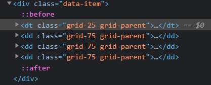
So I was snooping around in my profile today after viewing the accessibility videos published here on Treehouse, and couldn't help but notice something on the languages section. After the 768px breakpoint, it seems that the element that displays the "Spoken Languages" label(?) of the display defaults to float, which, after listing three or more languages slightly increases cognitive load when trying to visually parse the information. I've attached images to demonstrate.
I may be way out of my depth here, but it would seem to me that making the container contain two columns in a flex box could solve the problem. Any thoughts on this?


