Welcome to the Treehouse Community
Want to collaborate on code errors? Have bugs you need feedback on? Looking for an extra set of eyes on your latest project? Get support with fellow developers, designers, and programmers of all backgrounds and skill levels here with the Treehouse Community! While you're at it, check out some resources Treehouse students have shared here.
Looking to learn something new?
Treehouse offers a seven day free trial for new students. Get access to thousands of hours of content and join thousands of Treehouse students and alumni in the community today.
Start your free trial
Martin Lecke
14,385 PointsNew color Scheme for Team Treehouse
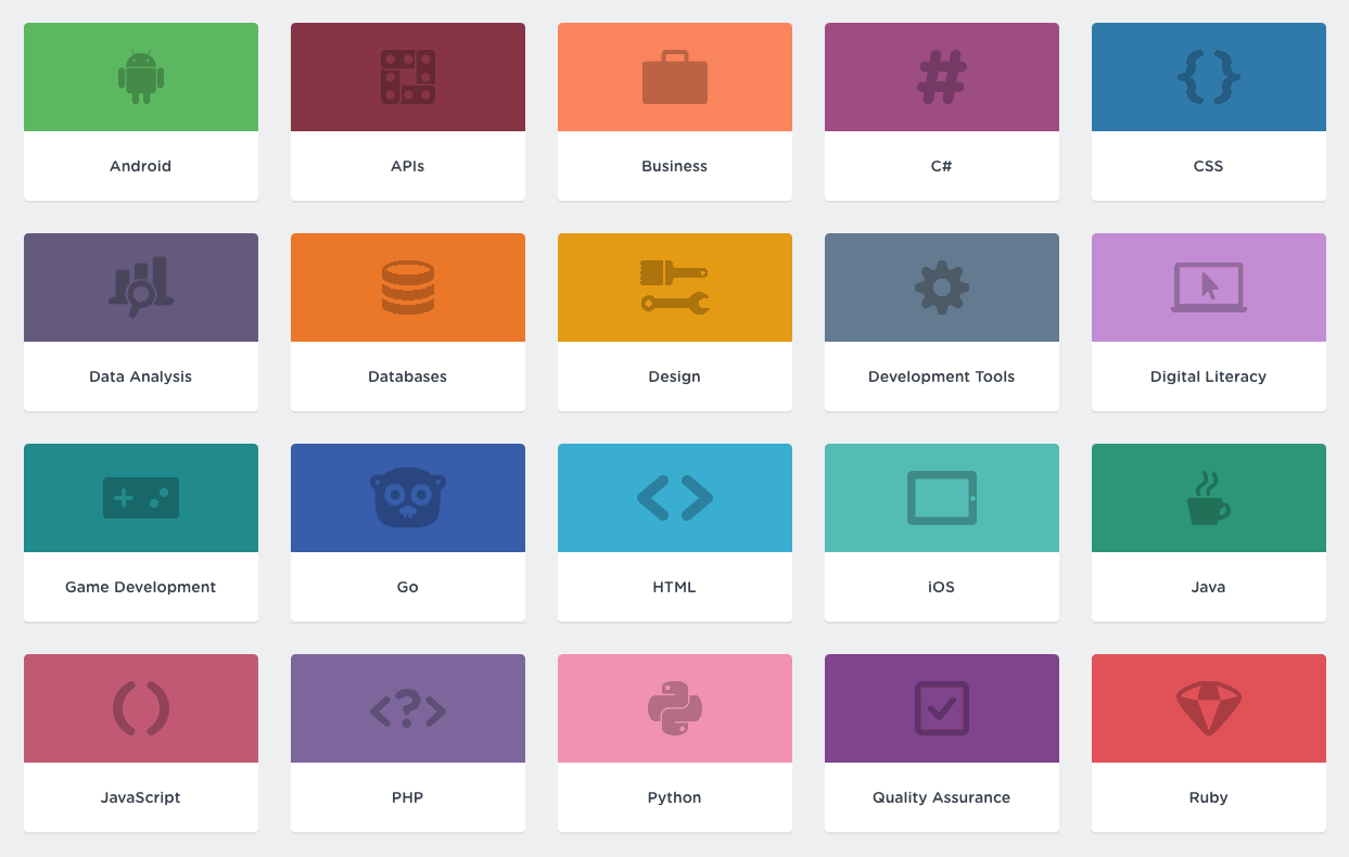
Wow, i really dislike the new color scheme you changed to here at treehouse. It's alot harder to see a difference now between the colors and languages. Javascript css and html are blue. This is not the same thing.
How did you think for people that are color blind? its almost the same shade of color on the purple, blue, green. The other color scheme was alot more clear.
Look at full stack javascript.. everything is blue. Hard to tell which was what. https://teamtreehouse.com/tracks/full-stack-javascript
Please change back or have someone else to pick colors. You might have a course already about this topic in your Design Area
12 Answers
Josh Davis
24,227 PointsI don't mind it so much, myself. But I can understand your frustration. With so many new topics becoming available at Treehouse, I can see how its hard to add new colors. If anything it is only simplifying the grouping of subject matter.
Kara Proulx
Treehouse StaffHey there! We do appreciate your feedback, and have made sure to share this with our Design Team as well. Thanks!
Martin Lecke
14,385 PointsThanks! I really like the new grouping of courses tho. Its really easy to distinguish each course with the old color scheme. And its more happier colors http://blog.teamtreehouse.com/wp-content/uploads/2017/10/Screen-Shot-2017-10-13-at-15.47.46.png
Alexander Davison
65,469 PointsI agree! The old theme was better :)
It made it easier to distinguish between languages/topics.
Eleeza Amin
34,496 PointsLol, I got so used to the old colours it's gonna take me a while to tell which is which and get used to it
Kevin Archer
2,619 PointsI'm a fan. Grouping all of the front-end courses under one colour is a great idea. It's not like we navigate the site exclusively by colour do we? It's now very easy to tell what direction my course choices are leading me.
Axel Perossa
13,930 PointsI get having more than 20 topics is hard when it comes to colors, but I think this change wasn't really tested with accesibility in mind. I'm a bit short-sighted and I usually like to do the courses without glasses or lenses on, I just adjust the zoom a bit. I could clearly distinguish the different colors before (around my avatar e.g.), now it's all a blurry mess of dark all-alike colors.
Steven Parker
231,007 PointsI'm definitely going to miss the old color scheme; it had a more "fun" look and made it easier to spot specific topics I was interested in. I understand identifying by categories, but it doesn't relate to my interests like identifying by topic did. But frankly, I've been suspecting it might not be sustainable with the ever-increasing number of topics and the associated increasing difficulty in choosing visually distinctive colors for them.
Then after reading the blog article I understand WCAG compliance was another motivation for the change. I've been finding that a significant restriction on creativity myself recently with projects that require compliance. The AA standard doesn't allow for much deviation. It's ironic that the standard intended to help those who have trouble resolving low contrast also works against those who have trouble resolving color differences.
Stefan Brouwer
9,046 PointsI do agree with Martin on this one. Right now the colors are way to dark which makes it hard to see the difference, especially when you use the small dots. Even for me it's hard (looking at the dots), let alone for someone that is color blind.
That said, grouping it in a different way is a good thing! Combining this with the old color scheme would make it much better in my opinion.
Darrin Spell Jr
Full Stack JavaScript Techdegree Student 10,303 PointsI understand the idea behind the new color scheme but I have to say this. Does most of it have to be different shades of blue? It makes it much harder to differentiate the categories. Could have went with red, blue, green and pink to make them stand out more without running out of colors. Simplified but not over complicated which is what I feel like all these shades of blue does.
Wesley Trayer
13,812 PointsI know that treehouse was running out of colors, but now the color scheme is so dark. I like bright colors, like the old python pink.
Perhaps they could ring the new color dot with the old color. That wouldn't be as simple as it used to be, but it would allow for both color schemes.
Corey Whaley
3,103 PointsI understand the reasoning, but the old color scheme was better. The new colors are way too drab, and too close together in hue. There are basically only three colors. So why bother at all? I understand the WCAG thing, but why not allow options for WCAG compliance? A toggle perhaps in one's profile?
I can't differentiate between courses/tracks like I used to. For me, it's like you removed color-coding altogether.
This was my favorite course website, but now your "improved" UI is creating a worse UX. Perhaps take the classes you offer in those areas.
Henri CLOCUH
31,209 PointsThe old scheme was better!!!
Evan Fraser
6,789 PointsThe old color scheme was way better, made more sense and it was much easier to differentiate the topics. Now the colors are just boring :(
Martin Lecke
14,385 PointsMartin Lecke
14,385 PointsYes they had alot of colors already. But the new grouping helps lowering the number of colors https://image.ibb.co/m4Xf8K/Untitled_1_copy.png But there is alot more colors to choose from than these autumn colors